 Workspace
2 Apr 2025 · Udit Chauhan · 4 min read

Workspace
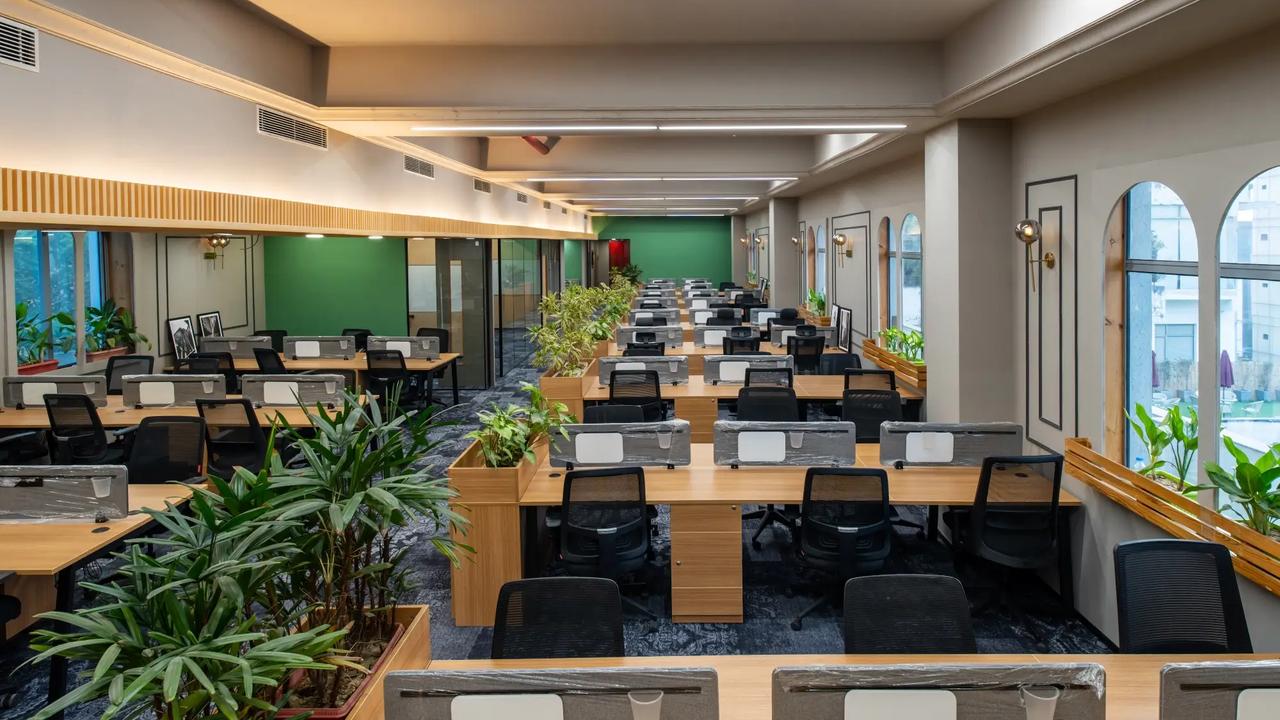
Ever walked into a room and immediately felt calm, energized, or maybe even anxious? That wasn’t just your imagination—it was likely the color at work. In office interiors, color isn’t just about making a space look pretty. It’s a silent influencer, shaping mood, behavior, and even productivity.
Think of color as the handshake of your office. It’s the first thing people notice, and it instantly sends a message—whether it’s “We mean business” or “Let’s get creative.” And once that impression hits, emotions follow fast.
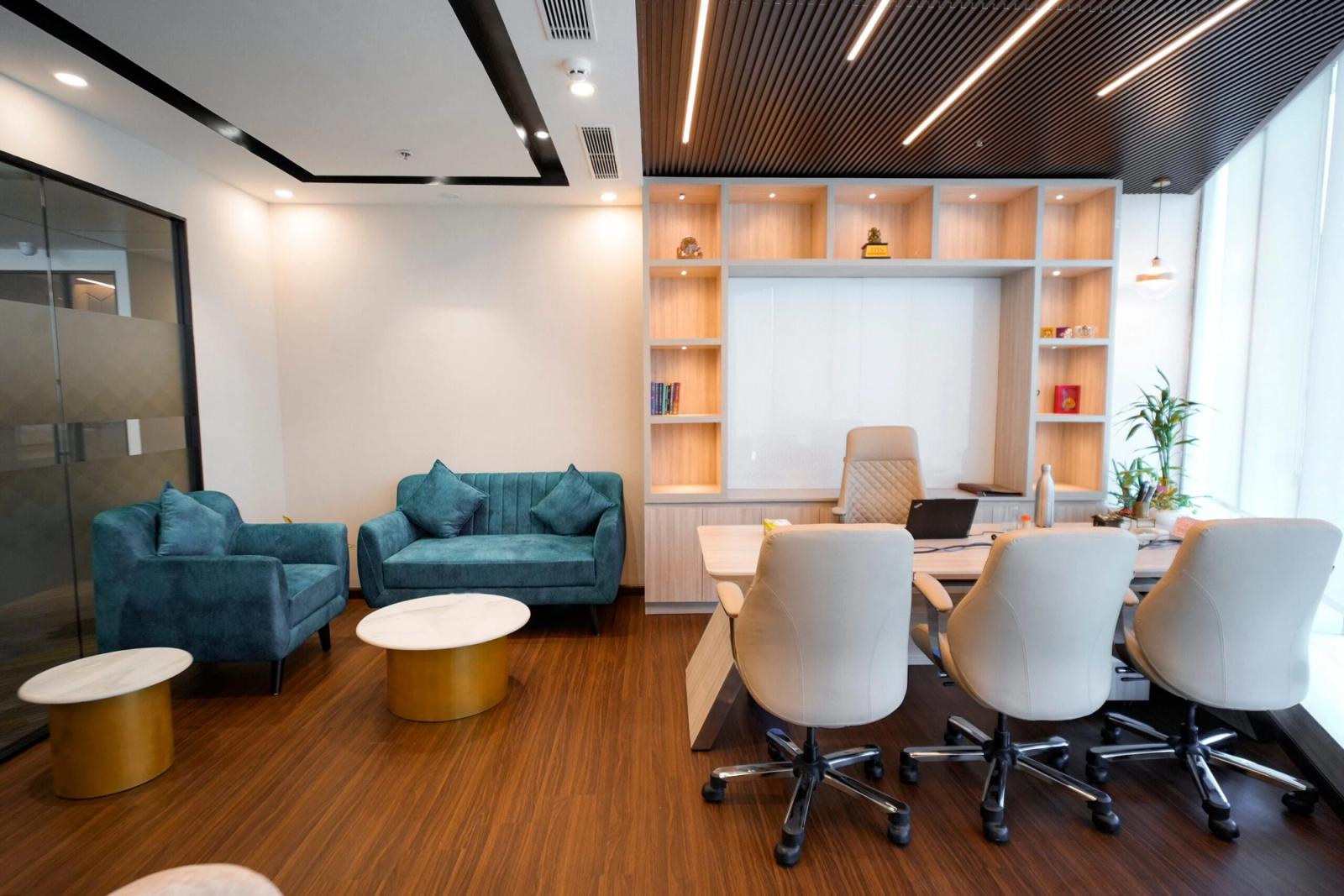
Color psychology studies how colors affect human behavior and emotions. It’s a blend of science and emotion, and when used strategically, it can transform an average office into a space people love to work in.
Our brains process color faster than text. Certain shades trigger biological responses: red can raise your heart rate, blue can slow it down. It’s powerful stuff. That’s why designers across industries—and even global corporations—take color selection seriously. According to Verywell Mind, colors impact both mood and decision-making, especially in professional environments.
You might not notice it, but color can influence how much you get done. Need to brainstorm? Warm colors like yellow can spark creativity. Need to focus? Cooler shades like blue can help you tune in.
Blue is a go-to color for a reason. It’s calming and inspires focus—perfect for analytical tasks or deep work. It also builds trust, which is why so many corporate offices lean into it.
Green brings the outside in. It’s restful for the eyes, promotes balance, and even reduces anxiety. Plus, it pairs beautifully with biophilic design trends that incorporate plants and natural materials.
Yellow is the color of fresh ideas. It boosts enthusiasm and creativity, making it ideal for innovation hubs or brainstorming zones. But go easy—too much yellow can feel overwhelming.
Red is bold and energizing. It’s best in small doses—maybe in common areas or as an accent wall—because it can increase alertness but also cause agitation if overused.
White keeps things feeling fresh and modern. It reflects light, which can make small offices feel bigger. But it needs some warmth—otherwise, it can feel sterile or bland.
Grey walks a fine line. When styled right, it feels sophisticated and timeless. But too much can suck the energy out of a room. It needs to be balanced with textures, lighting, or pops of color.
Bright, energizing colors in work areas can boost enthusiasm. For example, a splash of orange in a meeting room can foster lively discussions and engagement.
Soft blues, greens, and pastels help create a stress-free vibe. Perfect for lounges or quiet zones where employees can recharge.
Color can zone your workspace: use energetic colors in shared spaces to stimulate collaboration, and cooler tones in focused work areas to minimize distractions.
Open spaces benefit from a mixed palette. Break up the vastness with color to define zones. Private cabins can afford richer, more personal color choices aligned with the individual or function.
Instead of walls, use color to define areas: a deep green focus pod, a vibrant orange breakout area, a calm blue meeting nook. It’s visual storytelling without physical barriers.
Studies show women often prefer softer shades, while men lean toward bold, saturated colors. But it’s not a rule—understanding your team’s preferences is key.
Colors carry different meanings across cultures. Red can signal prosperity in China but danger in the West. When designing for a global team, context matters. For more, check out this HBR article on workplace design and culture.
Too much intensity can overstimulate. Bright colors are great in moderation—use them like spices, not the main dish.
A small room with no natural light painted in dark colors? That’s a recipe for a cave, not creativity. Always consider the light and layout.
Color should reflect who you are. A law firm might go for greys and blues, while a creative agency might play with turquoise and tangerine.
When designing your office space with psychology-backed color schemes, it helps to consult professionals. Also, offers tailored office interiors that combine smart design, ergonomic layouts, and purposeful color choices—ensuring your workspace not only looks good but feels right too.
Startups love color. Think bold reds, lime greens, electric blues—colors that signal innovation and agility. It’s part of their brand identity.
In contrast, law firms stick to the classics: navy, charcoal, white. These colors convey stability, confidence, and professionalism.
Earth tones, muted pastels, and terracotta shades are on the rise—soft, grounding, and perfect for hybrid work environments.
Smart lighting now lets you change color temperatures through the day. Imagine your office evolving from cool morning blue to warm evening amber—just like nature.
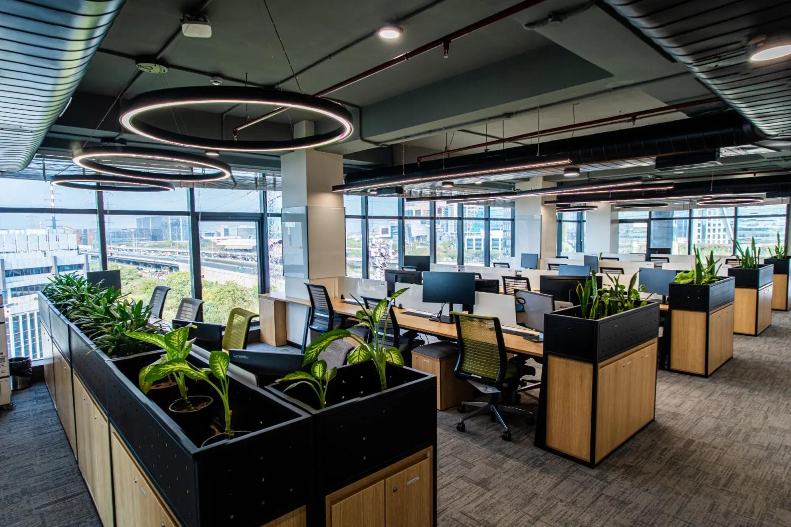
Color isn’t just a design detail—it’s a game changer. It affects how we feel, think, and perform. The right shades can turn a dull, uninspiring office into a vibrant hub of creativity and calm. So next time you’re picking paint, think beyond aesthetics. Think emotion. Think culture. Think performance. Because every color tells a story—make sure yours says the right thing.
Workspace2 Apr 2025 · Udit Chauhan · 4 min read
 Workspace
27 Mar 2025 · Udit Chauhan · 7 min read
 Workspace
22 Mar 2025 · Udit Chauhan · 3 min read
Ready to move your team?
Fully-managed private offices across Gurgaon's prime corridors — move-in ready, fully serviced, sized for your team.